trust and mistrust
Denmark is often mentioned as a high-trust society, the United States as a low-trust society. Having lived in both places for a number of years, you can feel the difference: in how public and private systems operate; in signage and instruction; in expressed opinions; in psychological safety; in pedagogy; in how parents talk to their children (and vice versa).
What it means to be a high-trust (or low-trust) society has more than adequately explored elsewhere. For this post, I'm more interested in the design of high-trust and low-trust systems. High-trust and low-trust systems make fundamentally different assumptions about their users. Inevitably, these assumptions are reflected in how these systems look, feel, and function.
sign, sign, everywhere a sign
Blockin' out the scenery
Breakin' my mind
"Do this," "Don't do that"
Can't you read the sign?
- Five Man Electrical Band, Signs
North America has an obsession with signs. There's the No sign:
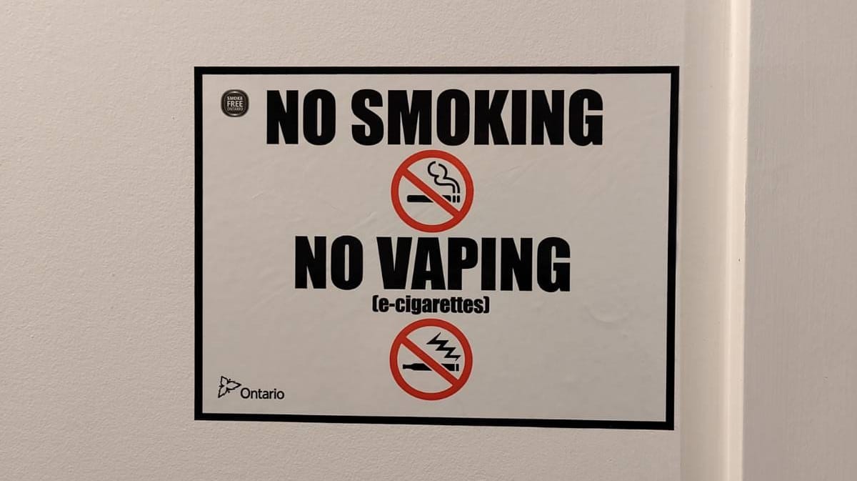
These signs tell you what not to do. Here the Ontario provincial logo at bottom-left immediately escalates to the implied threat of legal punishment. This legalistic approach is extremely common with No signs.
After all, why appeal to common sense, reason, responsibility, personal goals, or societal values when it is better to be feared than loved? Low-trust systems subsist on a diet of threatening language, interfaces, and interactions. They love Impact font, red No circles, ALL CAPS, security theatre, and the general appearance of authority.
Then there's the ELI5 (explain like I'm five) sign:
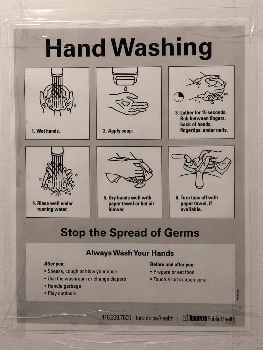
These signs at least articulate a positive message: that is, they point you towards what to do, rather than warning you against what not to do. Unfortunately, they tell you exactly how to do it with no room for thought, using simplistic language that can often seem condescending or lacking in useful nuance.
Why these particular steps, in this particular order? ELI5 signs aren't concerned with helping the reader build a useful mental model. Low-trust systems remove agency from users, thinking for them rather than with them. Users are presumed incapable of learning.
There's also the Command sign:
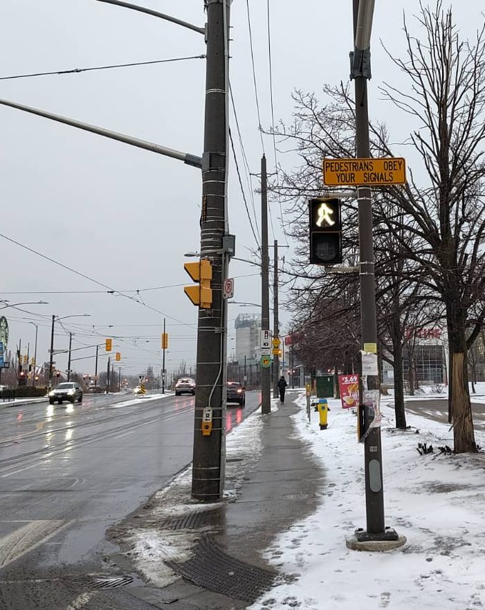
These signs mix the imperative language of No with the condescension of ELI5. You could just as well imagine a drill sergeant yelling at pedestrians: Obey!
This particular sign also singles out one user group - the unfortunate pedestrian who must navigate this busy intersection. What about the cars, bicycles, streetcars, and busses that share use of the intersection with pedestrians? What about those with impaired mobility, who might well have difficulty crossing the street in the allotted time? The command reflects the history of jaywalking as an invented crime.
To low-trust systems, concepts like fairness, usability, accessibility, and flexibility are secondary to keeping users in line. Users are expected to conform to the system, not the other way around.
BART: a case study in user hostility
I lived in the San Francisco Bay Area for 6 years. Like many residents, I had a love-hate relationship with BART (Bay Area Rapid Transit), the public transport system. It existed, which is not something you can take for granted in North America. It brought together a vibrant slice of humanity, occasionally erupting in No Pants Subway Rides and brawls and spontaneous parties. As someone with a soft spot for weirdness - one of the few things I miss living in Denmark - it's easy to see where the love part of the equation came from.
The hate was also well-earned. BART had a reputation for abysmal service and filthy vehicles, which could be the focus of its own article. They also had a fundamental mistrust of their users; BART is a masterclass in holistic user-hostile design.
Back in 2010, the BART ticket machine interface looked like this:
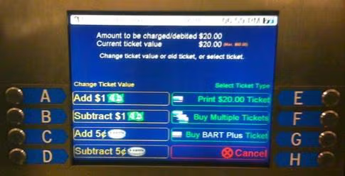
Quick! You just arrived at SFO airport, exhausted and jet-lagged as hell. You're headed to 12th St Oakland City Center. Your train leaves in 2 minutes. Before you can board, though, you have to decipher the BART fare table to figure out how much to pay, and then you must contend with an interface so infamously bad that UC Berkeley used it as the basis of a course project around UI / UX improvements. Guess you're waiting for the next train.
Fortunately, BART finally enabled tap-to-pay with cards in Aug 2025, so you can now avoid this particular UX hell.
What about the ticket gates themselves? In 2025, BART installed shiny new spike-topped fortress gates for its stations:
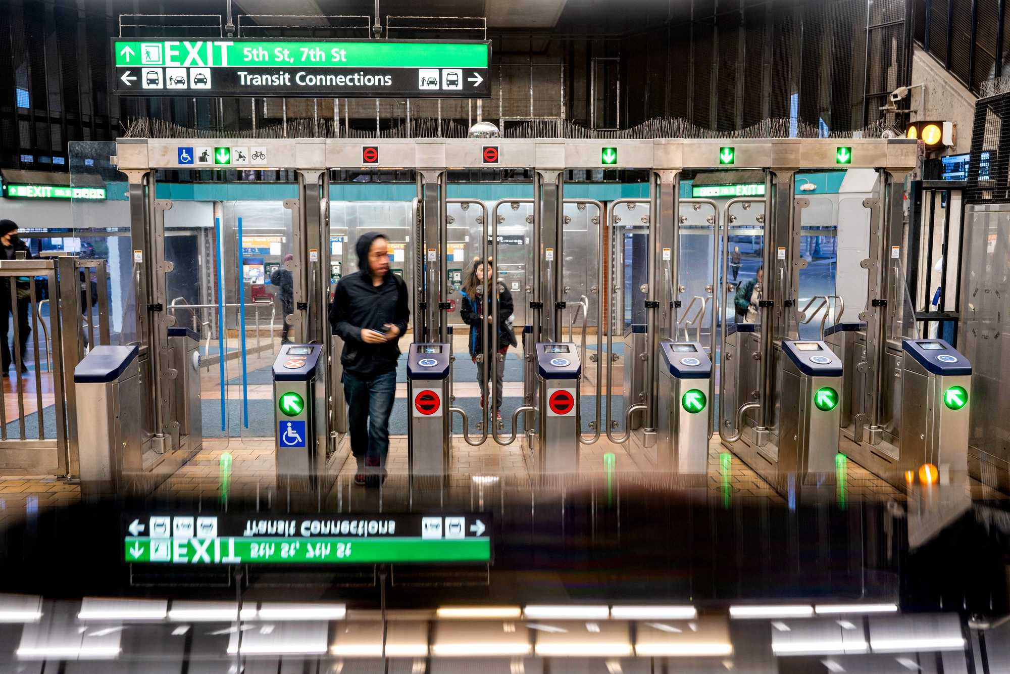
This is the essence of low-trust design. At every point, you're treated less like a user and more as a potential fare evader. Disproportionate energy is spent on preventing fraud and misuse, often at the expense of usability. The user is made painfully aware that they are surveilled and constrained, that the system is protecting itself from them.
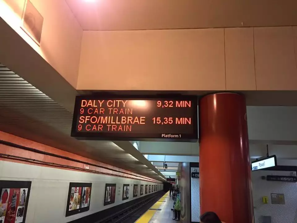
And then there's the experience of BART itself. In 2021, I once had to wait nearly an hour at MacArthur. Outside peak times and downtown areas, 20-30 min waits are not unusual.
And what if service delays make you change your mind after you've entered the fare gates? Not to worry! BART has a low-trust interaction for that too:
The excursion fare is $7.10. Entering and exiting at the same location within a three-hour window is seen by the fare gate software as an "excursion," and you will be charged the excursion fare...It also prevents some forms of fare evasion and abuse of parking rules.
- https://www.bart.gov/tickets
No surprise that this indignity has its detractors, who have calculated just how much BART makes off the excursion fare (answer as of 2017: $3.4M). It reminds one of AOL charging customers for dial-up services they hadn't used in years.
For comparison: the TTC in Toronto and Metro in Copenhagen both come every 3 min in peak hours, every 6 min off-peak. This is frequent enough that you don't need to plan your journey in detail. You just show up and take the next train. Try doing that on the BART.
The BART ride itself is noisy - holding a conversation at anything short of shouting volume is difficult, especially in the tunnels. In 2009, a study found mean noise levels of 80-100 dBa, which noise charts compare to such pleasant sounds as jet engines, motorcycles, and blenders.
But eventually you reach your destination. The astute reader might wonder: since the fare is different between every pair of stations, what if you don't have enough on your card to cover your trip? After all, you can enter through the fare gates as long as you have the minimum fare on your card.
The answer: when you go to check out, your fare card balance isn't sufficient, and you can't exit through the station fare gates until you fix that at the Add Fare machine.
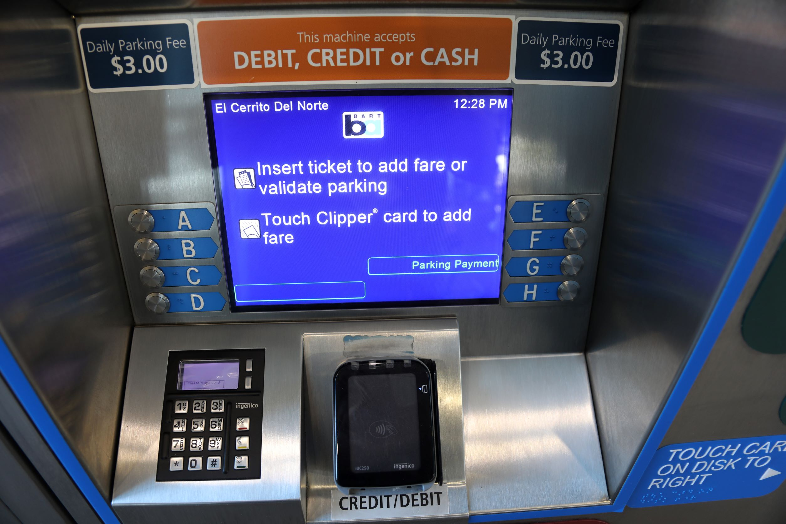
Until BART rolled out regular ticket top-up machines inside the pay area in 2019, you could only add the exact amount you need to exit, and only in cash. If you didn't have that, your next option was to beg the ticket attendant to let you use the normal ticket top-up machine in the unpaid area. They would open the gate, watch carefully from their metal booth (with the help of one or more conspicuously-placed CCTV cameras) to make sure you topped up, then open the gate again so you could tap out.
Does BART improve over time? Yes - but slowly. So much effort goes into either low-trust design flourishes or patching around previous UX debt that meaningful improvements requested for decades get ignored.
Nine timezones away, the Copenhagen Metro is comparatively easy to use. Most riders use a rejsekort (travel card), which you fill at these machines:
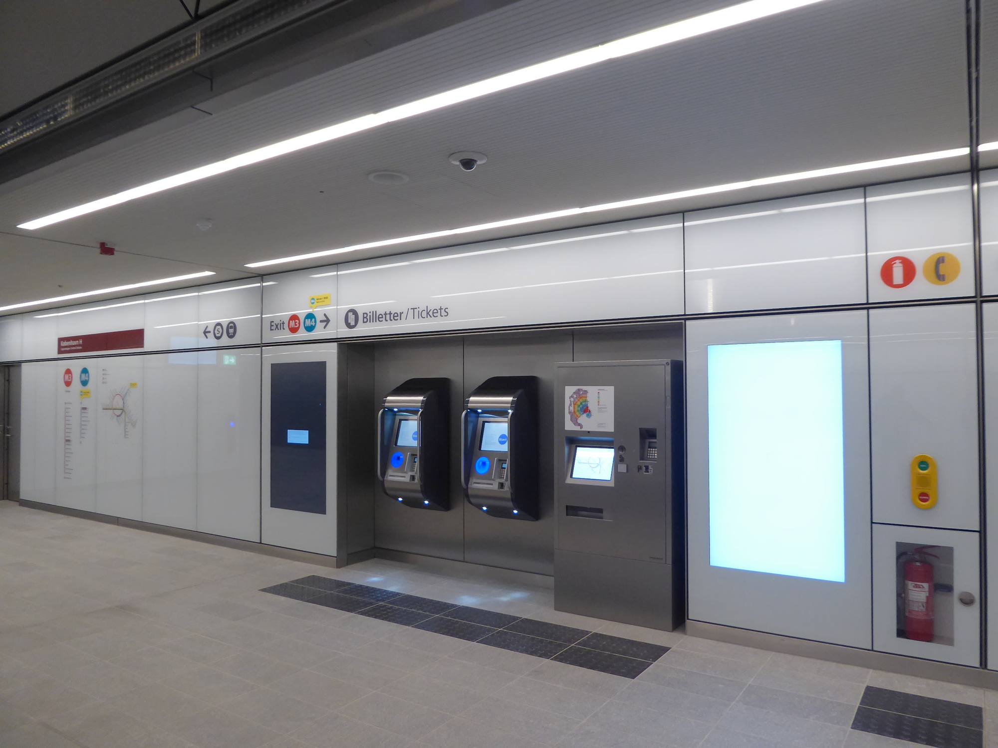
_03.jpg)
Once you have enough money on your card, you check in at one of these check-in points, which are sprinkled throughout the station and platform area:
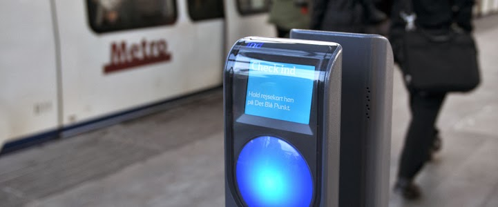
That's right: there are no fare gates. You just tap in and walk down to the platform, where you'll wait 6 min in off-peak periods and 2-3 min during the peak.
The Danes may be trusting, but they do check tickets often enough that fare evasion has negative expected value. No ticket? A fine will set you back 1000 DKK (about 157 USD as of time of writing).
At the end of your journey, you check out at a check-out point. If you don't have enough money on your card, you add more at the machine, then try again.
As a resident in Denmark, I don't even need to interact with the station machines. Instead, my rejsekort is linked to my national ID number, which in turn is linked to a registered Danish bank account. Whenever my card's balance drops below 50 DKK, the check-out point automatically debits my account and tops up my card.
Except I don't even interact with that anymore - there's now an app that you can use to check in and out. (I do bring my card around as a backup method, but only have to use it maybe twice a year.)
This is an example of a public transit system that starts from the assumption that the vast majority of its riders are trying to get somewhere, and that it should help them do that. System improvements steadily improve usability and user experience: more frequent and reliable service, lower-friction payment methods, clearer signage, continual investment into new Metro lines.
High-trust systems don't pretend that all users are trustworthy! Rather, they invest only as much as needed into preventing fraud and misuse. In doing so, they also aim to minimise the impact of prevention measures on usability.
a tale of two self-checkouts
Here's a high-trust self-checkout at Danish grocery chain SuperBrugsen:
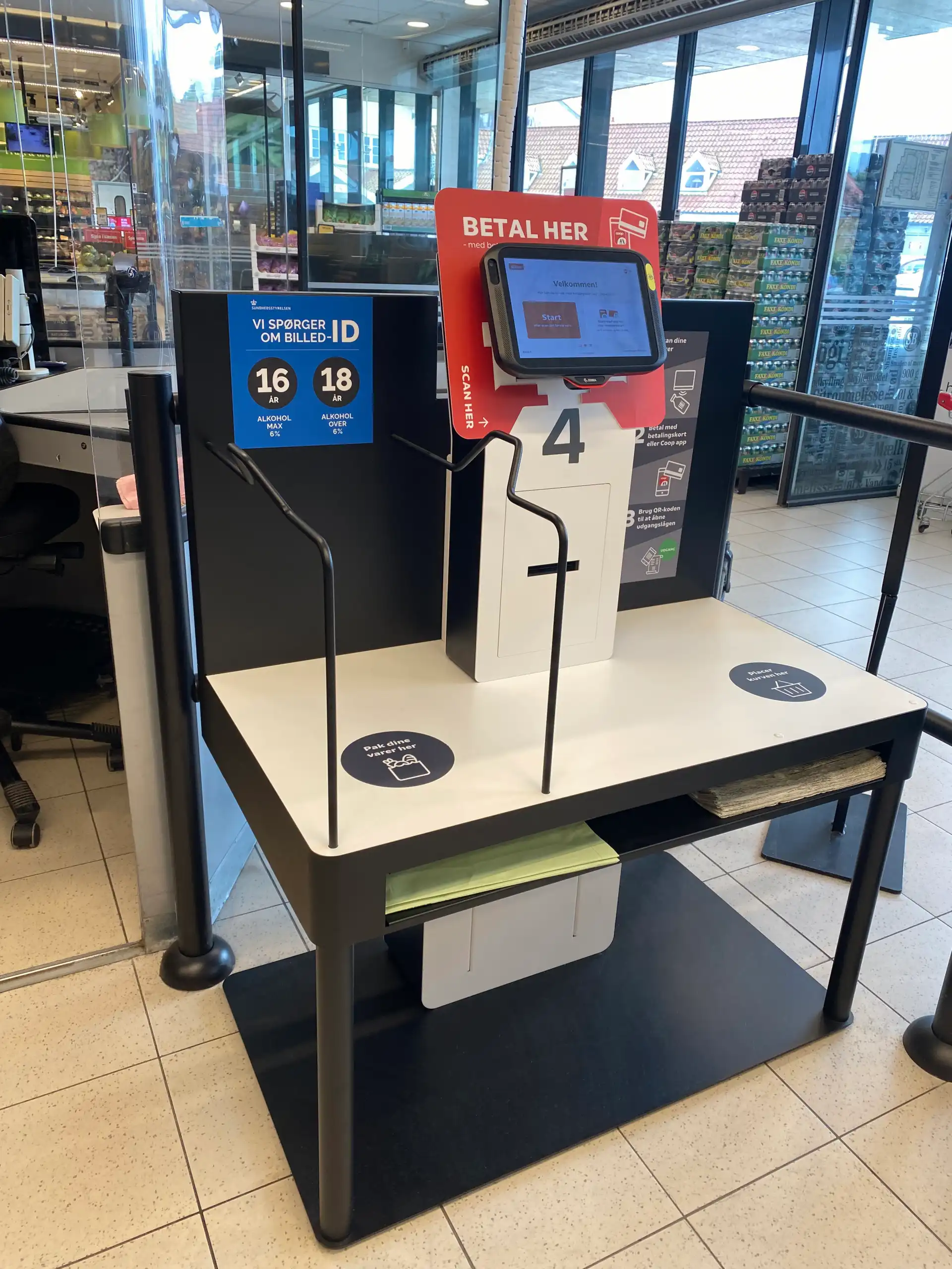
And a low-trust self-checkout at competing grocery chain Føtex:
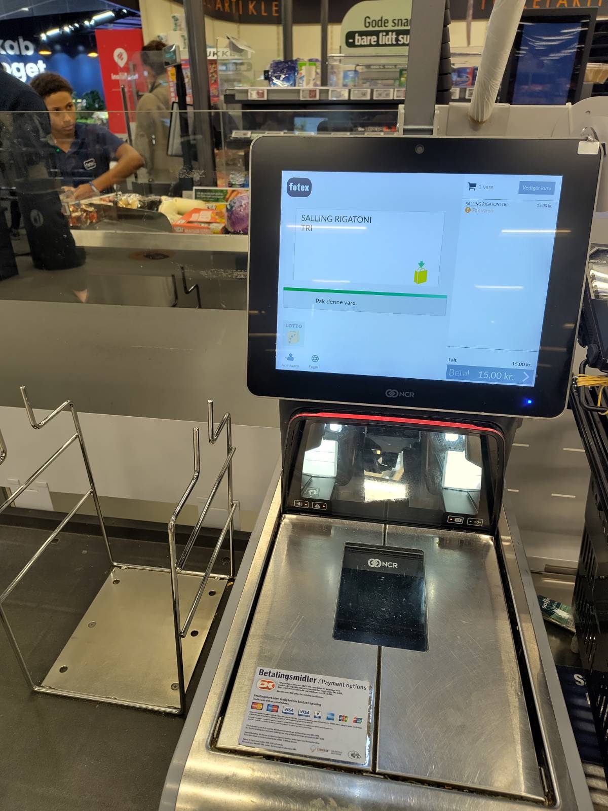
What's the difference? In the low-trust self-checkout, you can only scan one item at a time; it won't let you scan the next item until the previous item is placed in the bagging area. You can bring your own bag, but an attendant has to come by and verify that your bag is indeed a bag and not, say, 100g of saffron. If you make a mistake and double-scan an item, you can correct it, but an attendant must approve the correction. While you wait for their approval, a big angry red light flashes above your self-checkout station.
In the high-trust self-checkout, you put your own bag in the bagging area, scan your items however you please, bag them up, and leave. They do occasionally run spot checks, but these are fast and unobtrusive: they pick a random item or two and scan them in, and then you're good to go. It takes roughly half the time of the low-trust self-checkout.
This isn't an issue of upmarket vs. downmarket: SuperBrugsen and Føtex have similar market positioning in that regard. It's a matter of design choices. And these design choices cost money: I have on multiple occasions deliberately gone to SuperBrugsen to avoid the self-checkout experience at Føtex.
please help me think
It doesn’t matter how many times I have to click, as long as each click is a mindless, unambiguous choice.
- Steve Krug, Don't Make Me Think
For 25 years, the standard advice in digital usability has been to simplify tasks, remove choices, and minimise cognitive workload. Applied thoughtfully, this isn't bad advice: we should avoid useless complexity and distracting information, and we should avoid reinventing well-understood UI / UX patterns!
The danger lies in the extremes: in platforms that think for us, not with us; in recommender algorithms that always want to give us more of the same; in tools that impose a limited cognitive style; in streaming portals that compete with sleep, encouraging users to binge-watch and doomscroll.
I'd love to see more tools that are as simple as possible but no simpler. These tools:
- help users master tasks over time if they want to, rather than placing artificially low ceilings on interface expressiveness and task complexity;
- allow users to scale engagement up or down as they wish, and even assist in doing so, rather than aiming to maximise engagement at all costs;
- are honest with users about their limitations and help them move to alternative tools as they need to, rather than locking them in;
- let users configure their experience to their tastes and needs with reasonable defaults and limited guardrails, rather than prescribing a set experience;
- offer users ways to extend the user experience as needed, through plugins and extensions, rather than limiting them from doing so;
- enable users to help each other out by facilitating user communities and encouraging creative reuse and repurposing, rather than punishing unexpected uses and unapproved communications.
Note the words in italics: user agency is the essence of high trust.
Obsidian is a great example of these principles. Here's part of the template I use for my weekly planning:
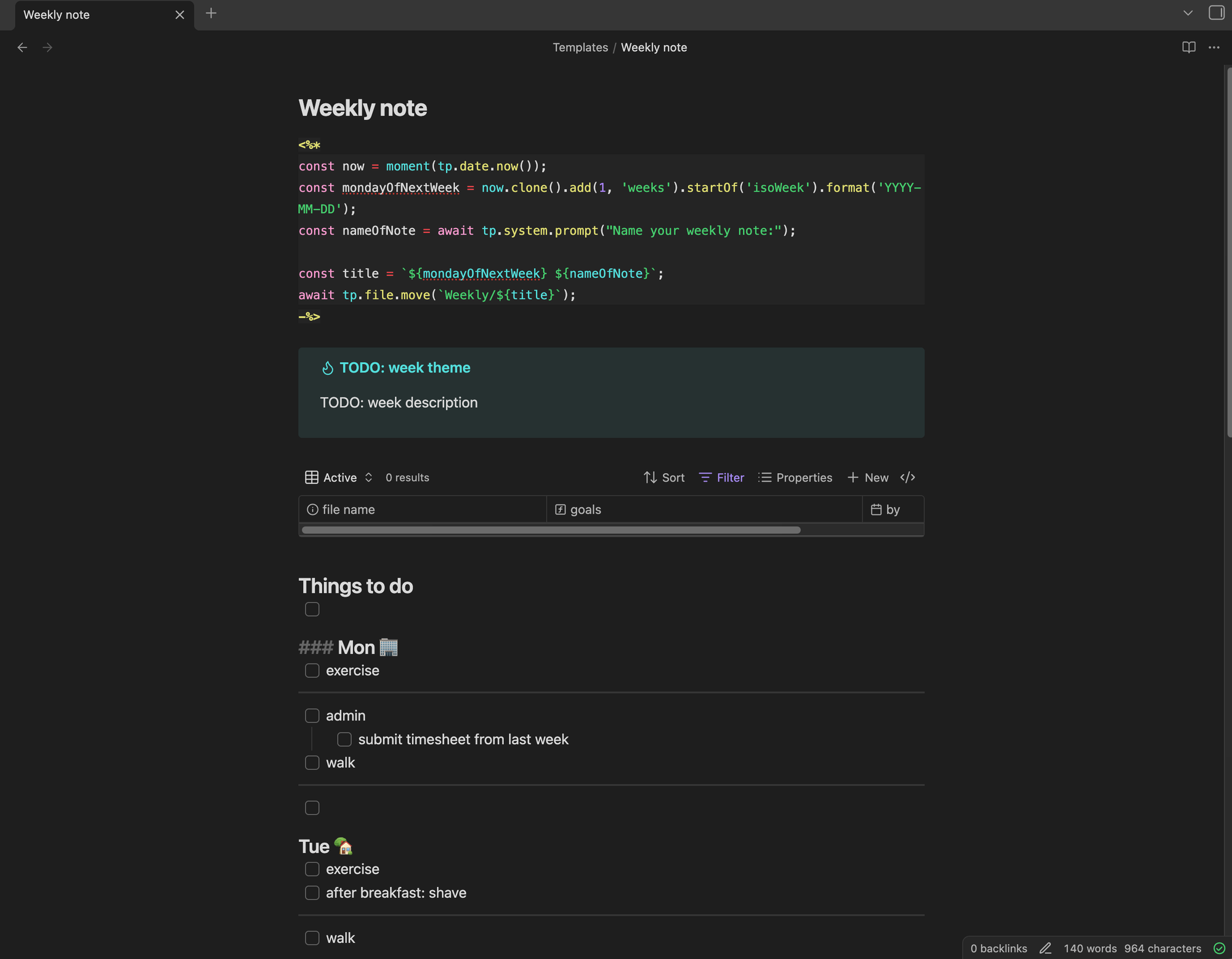
You can see several high-trust features at work here.
Right at the top, I'm using the Templater community plugin to include the date in YYYY-MM-DD format in my weekly notes, and move them automatically into the Weekly folder. It's great to be able to use my pre-existing programming skills to design my own custom workflow! But if you don't have those skills, you can just take the 30 seconds per week it would take to do manually, or use any number of other less-programmer-oriented plugins to achieve similar results.
I'm also using Obsidian Bases, which is conceptually similar to Notion Databases but with one key difference: Bases are just YAML files. Most users will use the Obsidian UI to edit them, but you could edit them directly. I don't do this myself, but I appreciate that the flexibility is there! It also fits with the mental model of Obsidian: everything is just text, and the UI is a sort of visual syntactic sugar on top of that. This same mental model makes it easier for users to contribute plugins, move their work to alternative tools if needed, and understand when to do their work elsewhere (e.g. image / video editing).
At the bottom-right, the little checkmark shows I'm a successfully synced-up customer of Obsidian Sync. That's right: I pay $4 / month to easily sync my notes between all my devices. The difference between this setup and, say, Adobe Creative Cloud is the absence of lock-in. I don't have to pay $4 / month; I could set up git and various mobile clients, or build my own plugin, or whatever. If I stop paying $4 / month, I don't lose access to my notes.
The problem I have with Don't Make Me Think isn't that it's bad advice. Product teams following Don't Make Me Think principles will make decent, usable software - but they will probably never make Obsidian. Building high-trust tools requires that we get out of the mindset of efficiency and finite short-term goals, and into a more infinite mindset of listening, improving, meeting people where they are, guiding them (with their consent!) to be capable of more.
when do I need high trust?
OK, you say, but what does this have to do with self-checkout kiosks or public transit gates?
Leaving aside that high-trust systems generally leave their users feeling respected and empowered: there are a few specific areas where, in my experience, high-trust systems really matter.
expert interfaces
When I led technical development of MOVE as part of Code for Canada, in partnership with the City of Toronto, our team was delivering tools meant to help traffic engineers make decisions about transportation safety improvements for a city of five million people.
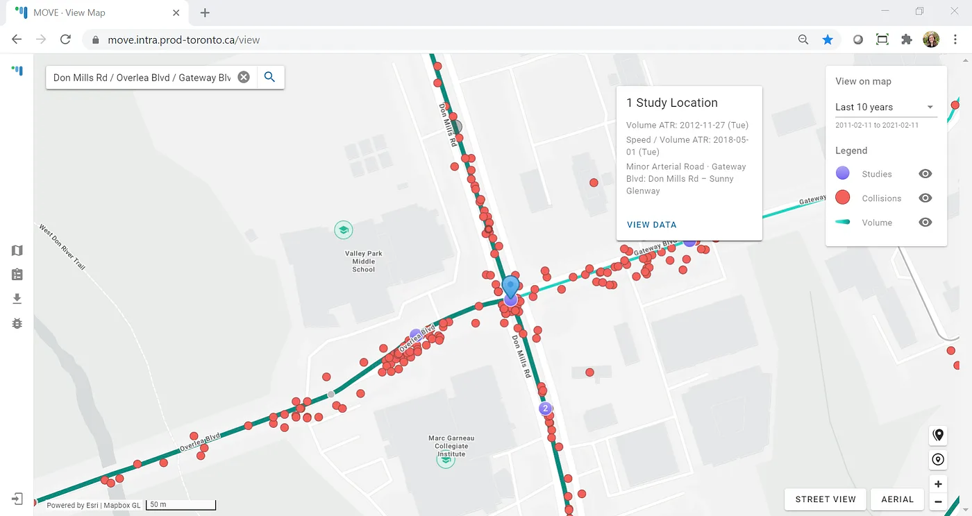
Many users can benefit from power-user features that help them explore, analyse, and export data as they wish. Expert users require those features. Their bar for reciprocating trust - putting trust back into tools that trust them - is also higher. In some crucial ways, systems can't truly be high-trust until their users trust them back.
As we developed analysis tools to help guide recommendations on installing new traffic signals, we needed to make sure our users had continued access to the same kinds of reports their legacy tools offered. In the process of porting over those reports, we discovered a couple of places where the calculations could be improved. Obvious fix, right?
Not so fast. We rolled these changes out, and soon started getting bug reports. Turns out our users would fetch the report from our system, fetch it from the old system, and compare the two. Our calculations followed official transportation planning manuals, but they were also different, and we weren't doing a good enough job of explaining that difference.
To fix this trust gap, we reached out to our users and sat with them to see exactly how they differed from the assumptions in the old tool. We also walked through our own calculations, and showed the reference manuals we had based those calculations on. Most importantly, we didn't enter these discussions assuming that our approach was right - we wanted to learn and understand.
The result was an implementation that still met the description in the official manuals while being closer to legacy tool results - and much greater trust from our users, both in the tool itself and in the team developing it.
personal tools
Obsidian is an example of a personal tool, where users have twin expectations of privacy and individualisation. Some other examples:
- personal media curation: podcast players, RSS readers, music libraries
- personal blogging: Ghost, WordPress (here privacy is about being able to edit in draft before publishing)
- personal note-taking: Obsidian, Notion, Evernote
- personal contacts: Contacts, Proton Pass
- personal fitness tracking: Gym Day, Simple
I should be able to trust these tools with data that is sensitive to me, even if it's not sensitive in the legal GDPR sense. I also want these tools to trust me to organise my notes, contacts, workouts, etc. as makes sense to me.
Note some things that are not on this list. Email clients: privacy is important, but individualisation is only needed to a limited degree (e.g. labels, folders, filters). Medical data portals: privacy even more important, individualisation even less so. Many tools are private but not individual. Some (e.g. broadcast-style social media) are individual but not really private.
chores
Self-checkout kiosks and public transit gates fit into this category. When I'm riding the Metro or buying groceries, I usually just want to get on with my day. Interruptions are frustrating, doubly so if I feel like I'm not trusted to do basic adult things. As noted: I'll avoid using low-trust self-checkouts, often going to the normal cashier lane - or even to a different store altogether. I suspect I'm not the only one.
Among these areas, this might be the one where standard Don't Make Me Think advice is most apt. I would like my self-checkout kiosk to be simple and straightforward. In fact, high-trust implementations here may well be simpler and more straightforward than low-trust implementations. How much development effort went into preventing users from scanning an item before the previous item is bagged? How many engineer-hours were wasted on this unnecessary logic?
Compare BART and Copenhagen Metro above: the Metro flow is definitely easier to navigate. Same for the high-trust self-checkout. If you can make a system higher-trust and easier to navigate, it's a failure of design to not do so. There are no bonus points for useless or user-hostile complexity.
last thoughts
Trust your users. Help them do what they want to do - don't spend more time telling them what not to do! Help them think, learn, and grow. Provide meaningful options and points of customization, not arbitrary limitations. Show a willingness to work with them to understand what meaningful means here - and follow through, repeatedly. That's how you build great tools, products, and systems.